TRCC Website Redesign
Role: UX Designer
Timeline: 1 Week, Design Sprint
Tools: Figma, Photoshop, Google Meet
Platform: Desktop
Overview: This project was a team Design Sprint aimed to redesign the website for the Toronto Rape and Crisis Centre (TRCC), a grassroots organization providing feminist, anti-oppressive peer support to survivors of sexual violence. The project team worked closely with the TRCC collective's core values to ensure that the redesigned website reflects the organization's mission while meeting the diverse needs of its users. Through user research, iterative design, and testing, the resulting website offers improved navigation, clear information, and a welcoming user interface. The redesign ultimately serves to amplify the TRCC collective's commitment to providing accessible and inclusive services to survivors of sexual violence, in support of their vision for a violence-free world.

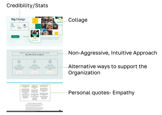
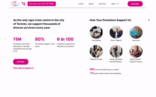
Before

After

Method
The Double Diamond process was chosen as the design method for the Toronto Rape and Crisis Centre (TRCC) website redesign project because it is a human-centered approach that prioritizes user needs and experiences. Given the sensitive nature of the TRCC's services, it was essential to create a website that was welcoming and accessible to survivors of sexual violence. By using the Double Diamond process, we were able to take a holistic approach to the project, exploring a wide range of possibilities and solutions before narrowing them down to a final design that met the project's goals and objectives.

Problem Space
The TRCC/MWAR has to fundraise $100,000 yearly to stay operational in order to support survivors of violence with counseling, court support, and other safety and financial services.
$100,000
yearly to stay operational
User Interviews
My hypothesis was that donors will feel more inclined to donate due to feeling a sense of
trust in the charity. This led me to assume that we would fundraise money by showing where our budget goes within the charity, as well as photos and descriptions of the impact the TRCC has had within the community.
This helped form the questions we made when conducting user interviews, we aimed to validate or refute this hypothesis and gain insights into the specific pain points, motivations, and behaviours.
= Pain Points
= Behaviours
= Motivations
Key Research Insights
Through affinity mapping my user interviews, I uncovered my key theme of trust in the charity.
Legend
= Pain Points
= Motivations
“I have concerns about where the donation money is going and the effictiveness of the organization.”
"I'm worried about being scammed or donating to a non credible organization."
“I need to trust the charity I'm donating to, I prefer to donate to well-known and reputable organizations.”
"I prefer to give to organizations that have a clear and effective impact with a low percentage of donations going towards administrative costs."
Persona
Through my user research, I identified that the users had difficulty trusting the charity, which I incorporated into the persona development process. Julia's pain points, for instance, were indicative of the concern many donors had about donating to a non-credible organization and the effectiveness of the organizations they donate to.
We made our persona a middle-aged woman because according to our research, the rate of giving is highest among people aged 35-54.

How Might We...
encourage Canadians aged 35-54 to donate to the Toronto Rape and Crisis Centre in order to increase annual donations to help victims of sexual assault and violence so they can provide more accessible resources?
User Stories & Epics
Based on our persona, a Canadian middle-aged woman who donates to charity, we created user stories that led us to establish three epics.
Our core epic centered around providing a section for the various services offered by TRCC and information about them, so users could see where their donations were going.
Services Information
Other Ways to Donate Function
Donation Reminders
.png)
Task Flow
Based on our user stories and core epic I was able to create a task flow based on the user story:
As a Canadian middle-aged woman donating to charity, I want to see all the different services that the charity offers so that I can know all the different ways that the charity is involved in the cause.

UI Inspiration
Before beginning to sketch I compiled UI Inspiration from various successful charity websites and mapped out the key characteristics I wanted to incorporate when designing our wireframes.
Sketches & Wireframes
After finding UI inspiration, my teammates and I created several sketches of the core pages of our task flow. We then met and used dot voting to choose our favourite components. We ultimately decided on a long-scroll homepage to ensure that users could easily access all the information they needed to build trust in the charity, ultimately increasing the likelihood of making a donation. After finalizing our sketches we then created wireframes of our designs.
Sketches


Wireframes

Usability Testing
The TRCC website redesign underwent one round of user testing with a total of five users to gather feedback and improve the design and user experience. The feedback highlighted the need for larger fonts and a larger CTA. Additionally, users felt that the About Us section was too long, but the client wanted to keep the section, so that change was not integrated.

Low-Fi - Hi-Fi
My wireframes went through several iterations, from version 1 to version 3, with significant changes made based on user testing feedback. These changes included
-
adding labels to the navigation menu
-
incorporating a progress bar during app setup
-
making the garden section a more realistic rectangular shape
Lo-Fi
Before

Hi-Fi

Hi-Fi Mockup

Key Learnings
1
It's important to keep the branding of clients strong when redesigning
2
Utilize team member's strengths and learn from
one another
3
Consider the users safety when designing for issues surrounding domestic violence
4
When there isn't a big timeline for a project, stick with simple but effective concepts
Measuring Success
To evaluate the success of TRCC's website redesign, we will use the following metrics:
-
Overall increase in website traffic and number of visitors who donate
-
Increase in donation amounts attributed to the website redesign
