Role: Product Designer
Timeline: 1 Week, Design Sprint
Tools: Figma, Photoshop, Google Meet
Platform: iOS
Overview: Every designer remembers their first design sprint. It's hard not to look back at your old projects with some judgments of what you know now. I've added this project to my portfolio to showcase what I learned and my growth since then. During my first Design Sprint, my group and I created the FreshRescue app, which is an online marketplace connecting local people and businesses with surplus food. The app creates a platform for food donation, fostering a sense of community and addressing the issue of food waste and food accessibility. The app offers a trading system similar to a marketplace, catering to consumers and restaurants, encouraging sharing, and reducing food waste.
FreshRescue App


Method
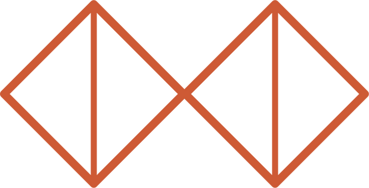
I decided to embrace the Double Diamond process for this project because it offered an iterative approach that perfectly matched our objective of creating a solution that truly caters to user needs while combating food waste. By going through the phases of divergent and convergent thinking, I had the freedom to explore numerous ideas and then carefully select the most promising ones. This allowed for a collaborative and user-centric design journey, where we could ideate, prototype, and iterate, ultimately resulting in a polished and impactful design for the FreshRescue app.
Problem Space
The problem space for the FreshResue app is the issue of food waste. The app aims to address the significant problem of food waste by creating a platform that enables people to donate surplus food to those in need. Food waste is a major environmental and social issue that has significant economic, environmental, and social consequences. By creating a system that fosters food sharing and redistribution, the app aims to reduce food waste, create a sense of community, and address the issue of hunger and food insecurity.
On average, businesses are taking a $74 billion loss on food waste every year.
$74
billion loss
User Interviews
The team conducted both in-person and remote interviews with a diverse group of potential users, including food donors and recipients, restaurant owners, and non-profit organizations.
These interviews helped identify pain points and challenges associated with food waste and donation, leading to the refinement of the app's features. Feedback from potential users also resulted in the addition of a feature that allows users to track the impact of their donations. Overall, user interviews were a valuable tool in the design process, helping the team to ensure that the app met the needs of potential users.
= Pain Points
= Behaviours
= Motivations
Key Research Insights
Through affinity mapping my user interviews, I uncovered my key theme of finding accessible eco-friendly options.
Legend
= Pain Points
= Motivations
“It's frustrating that I can't find a cheap option for fighting food waste."
“I struggle to find composting options that aren't a ton of work while living in an apartment.”
“Finding composting options in an apartment is hard. I want to be able to easily locate options close to me.”
“I want to find accessible ways to compost that show how I'm making a difference.”
Persona
During my user research, I discovered that many users struggled with finding accessible eco-friendly options, which I incorporated into my persona development. This is particularly evident in Marcus' pain points, as he struggles to find accessible eco-conscious habits that support student living.

How Might We...
help students manage their food waste in an affordable way and and identify opportunities to reduce food waste?
Task Flow
I created a task flow based on the user story:
as a student looking to reduce my food bills, I want to see what food items are near me so that I can find cheap food options and help reduce food waste.

Sketches & Wireframes
In the design process of creating the FreshRescue app, sketches and wireframes played a critical role in conceptualizing and refining the app's features and layout. The team started with the Crazy 8's method to generate multiple ideas, followed by the Blue Dot voting to select the most promising sketches and components. Based on these, the team created more refined sketches that were used to create the first round of wireframes
Sketches

Wireframes

Usability Testing
Usability testing was an essential component of the design process for the FreshRescue app, allowing the team to gather feedback and insights from potential users. During the testing phase, users were asked to perform various tasks using the app while the team observed and took notes on their interactions and feedback. The feedback from the usability testing was used to identify and prioritize improvements to the app's user interface, navigation, and overall user experience.

Hi-Fi Mockup

Key Learnings
1
Collaborate and utilize the strengths of team members, especially on a short deadline.
2
Be curious. Ask questions openly when learning something new.
3
Differences are superpowers. Acknowledge our differences as individuals and use them to play on our strengths.
4
Be open to pivots. Being open to things not working out, allows us to find new and better ways of furthering our ideas.
Measuring Success
To measure the success of the FreshRescue app, we will track the following metrics:
-
Number of donations made through the app, obtained through user feedback surveys and in-app analytics.
-
Reduction of food waste in participating local communities, measured by changes in the amount of food waste generated before and after the app's launch.
-
User engagement, including the number of downloads, active users, and user ratings on app stores. These metrics will help us evaluate the overall adoption and user satisfaction of the app.
